Built For
Every counter.
- Retail
- Restaurant
- Hotel
- Pharmacy
- Supermarket
- Cafe
- & more
An AI-first POS and hospitality suite built for operators who move fast.
An AI-first POS and hospitality operations ecosystem that combines Electron-based local runtime speed with cloud-ready operations, encrypted backup, multi-site monitoring, and industry-focused workflows.
I first joined the project in 2021, working with a specialist engineering team connected to one of the world's largest food-supply enterprises. Their client needed POS software for official hardware, and the existing interface needed to be brought up to a competitive product standard.
From 2021 to late 2022, I helped modernize the older UI, redesign core operator workflows, and raise the product quality bar for real counter environments.
The bigger product story became WizPos 2.0: taking a feature-light POS foundation and shaping it into a full large-SME software suite with hospitality extensions, local Electron runtime, ReactJS product layers, encrypted local stores, cloud backup, and real-time multi-branch control.
The vision is direct: make WizPos one of the fastest, most reliable, and most operator-friendly AI-first POS ecosystems for retail and hospitality teams.
Built For
Retail
Restaurant
POS + Hospitality Suite
Pharmacy
Cafe & Takeaway
Quick Setup
My first involvement happened in 2021, when I teamed up with an engineering group connected to one of the world's largest food-supply enterprises. The team was working with a separate client that needed POS software for its official hardware, and the existing interface needed a serious product-quality lift.
That collaboration continued through late 2022. My focus was to modernize the older UI, improve visual hierarchy, strengthen operator workflows, and make the system feel competitive in fast retail environments.
The larger product story is what I did with that foundation: I reframed WizPos from a feature-light counter tool into a fully functioning large-SME software suite. The product direction expanded into hospitality, multi-site retail, restaurant operations, hotel-connected services, payment workflows, and cloud-backed business control.
The result is WizPosTM 2.0: an AI-first ecosystem with local Electron runtime, ReactJS-powered product interfaces, backend-connected operations, encrypted local storage, encrypted cloud POS backup, real-time multi-location and multi-till monitoring, and advanced user management.
The vision is direct: make WizPos one of the fastest, most reliable, and most operator-friendly AI-first POS ecosystems for retail and hospitality teams.
The information architecture was reshaped around real operating sectors rather than generic POS menus. WizPos 2.0 extends from the sales counter into the service points that hospitality and SME operators run every day.
The hospitality idea is not a separate product line. It is the same POS intelligence extended across bookings, guest details, orders, payments, revenue, and multi-property visibility.
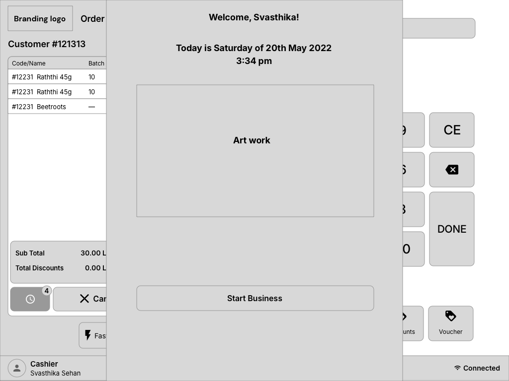
The newer screen set shows the product direction moving beyond a single checkout surface. Booking control, floor planning, restaurant workflows, retail checkout, product selection, and secure sign-in are treated as one operating suite for hospitality and large SME teams.
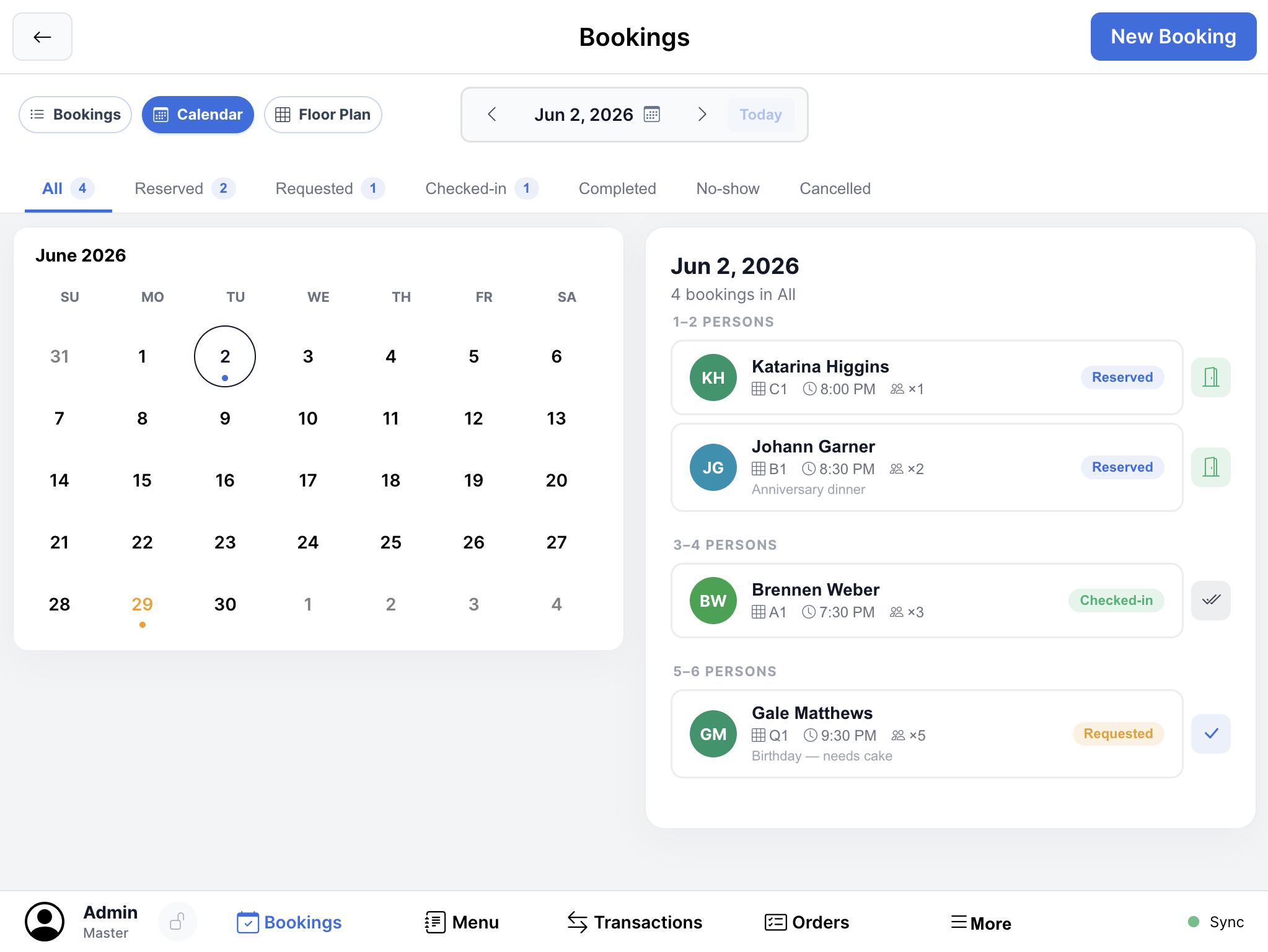
Booking engine - daily reservations, calendar context, and guest state in one control view
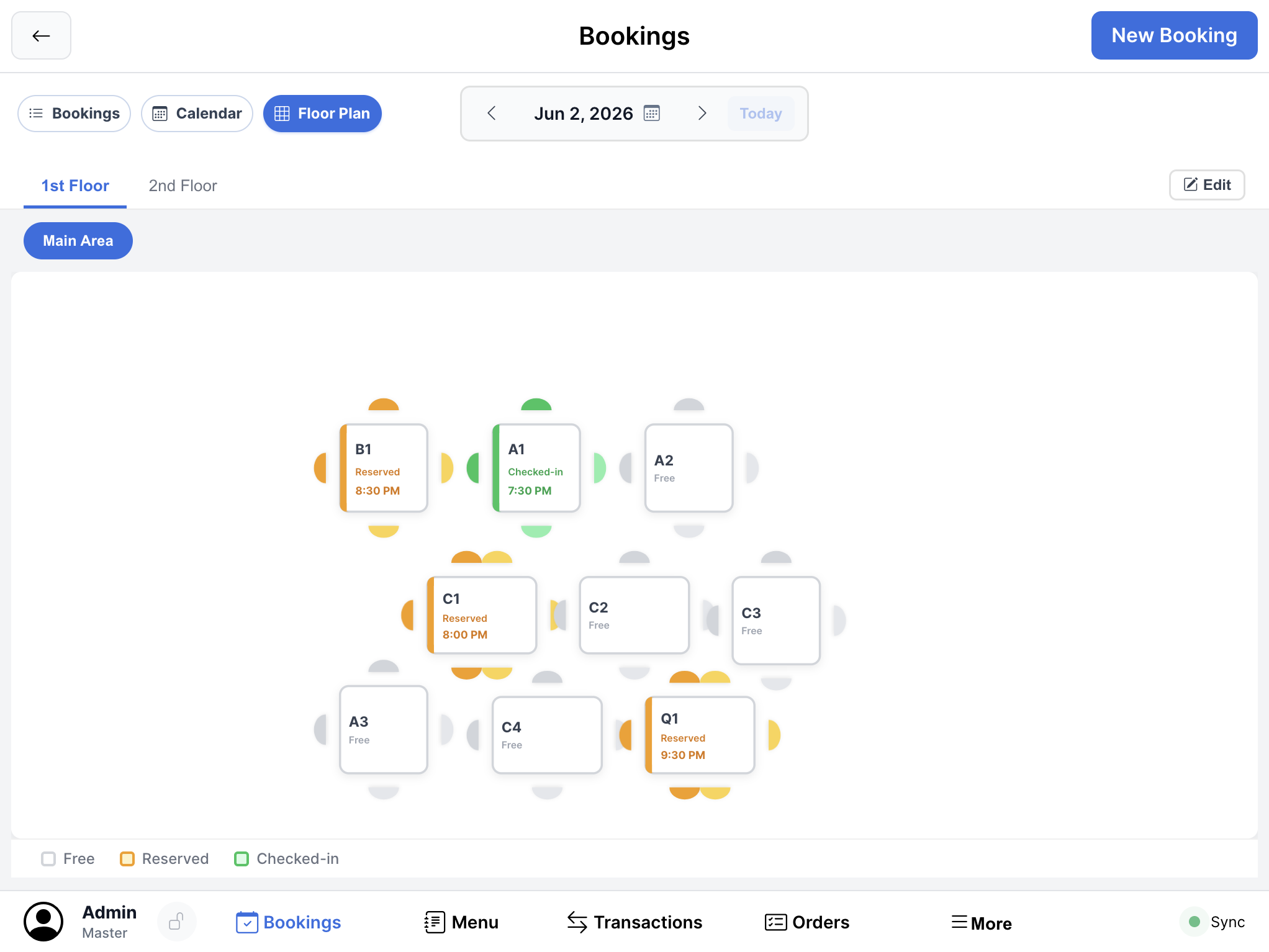
Floor planning - table states, seating layout, and service-area control for restaurants and venues
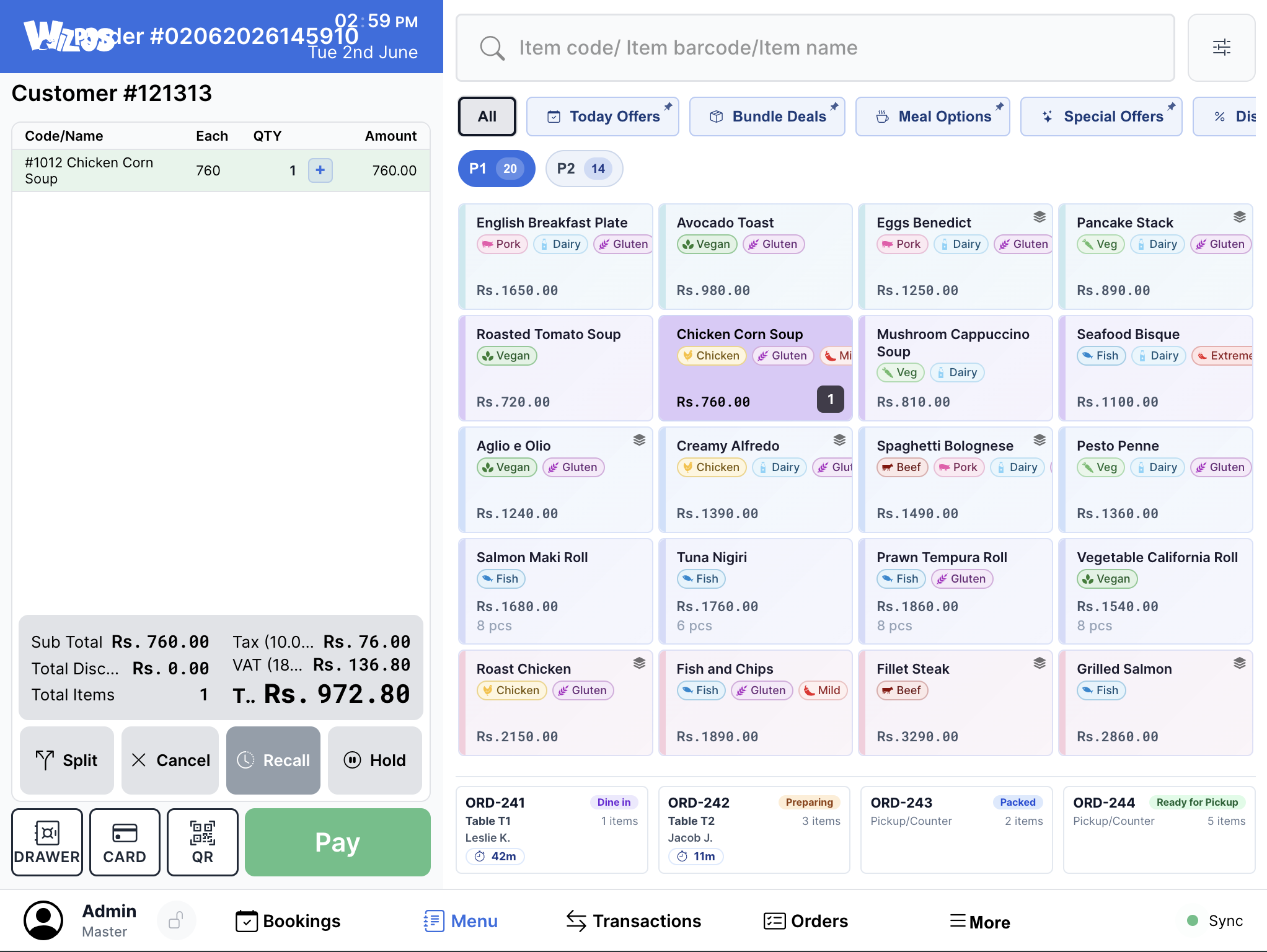
Restaurant checkout - category-led ordering with large targets for fast service counters
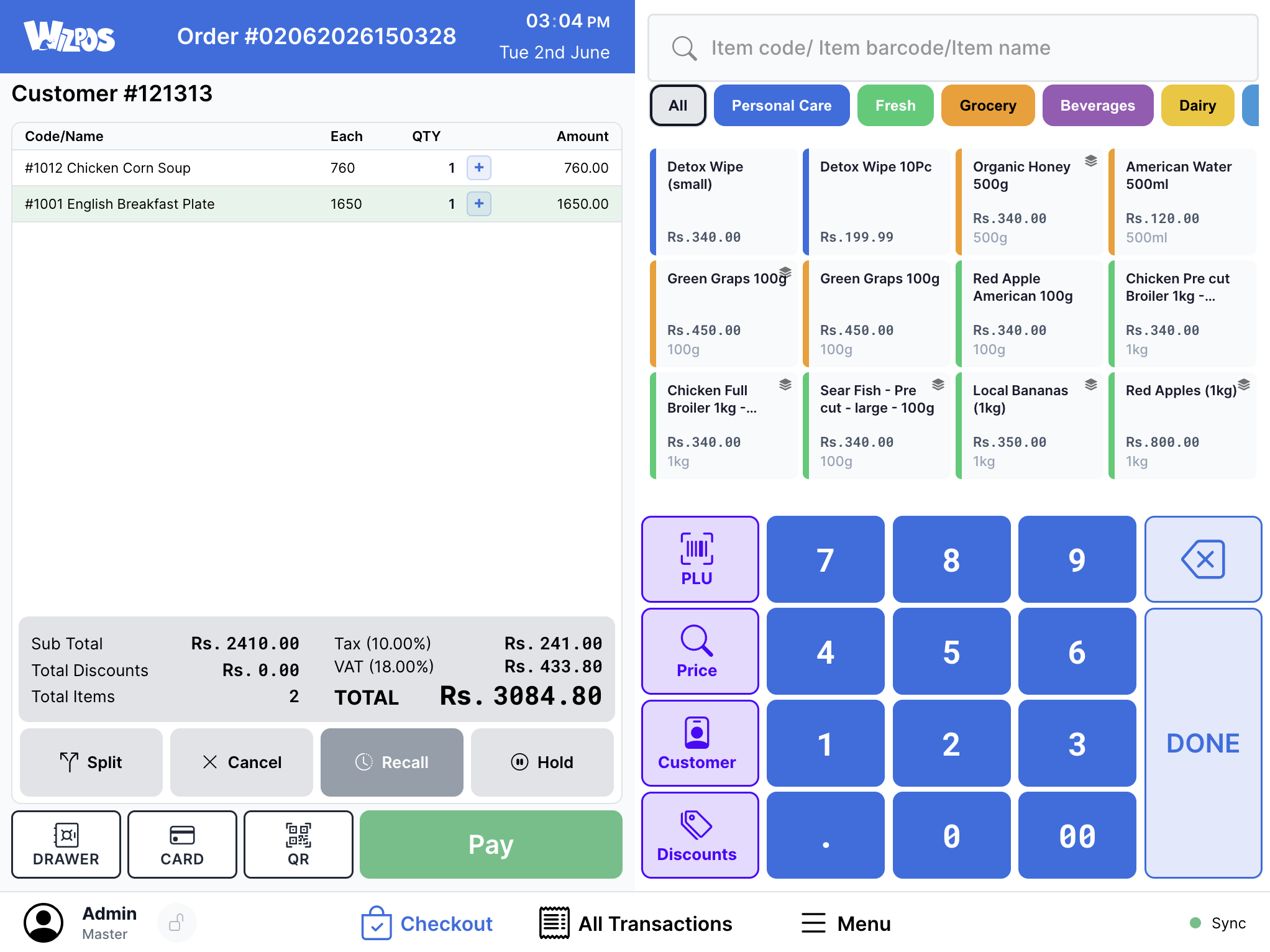
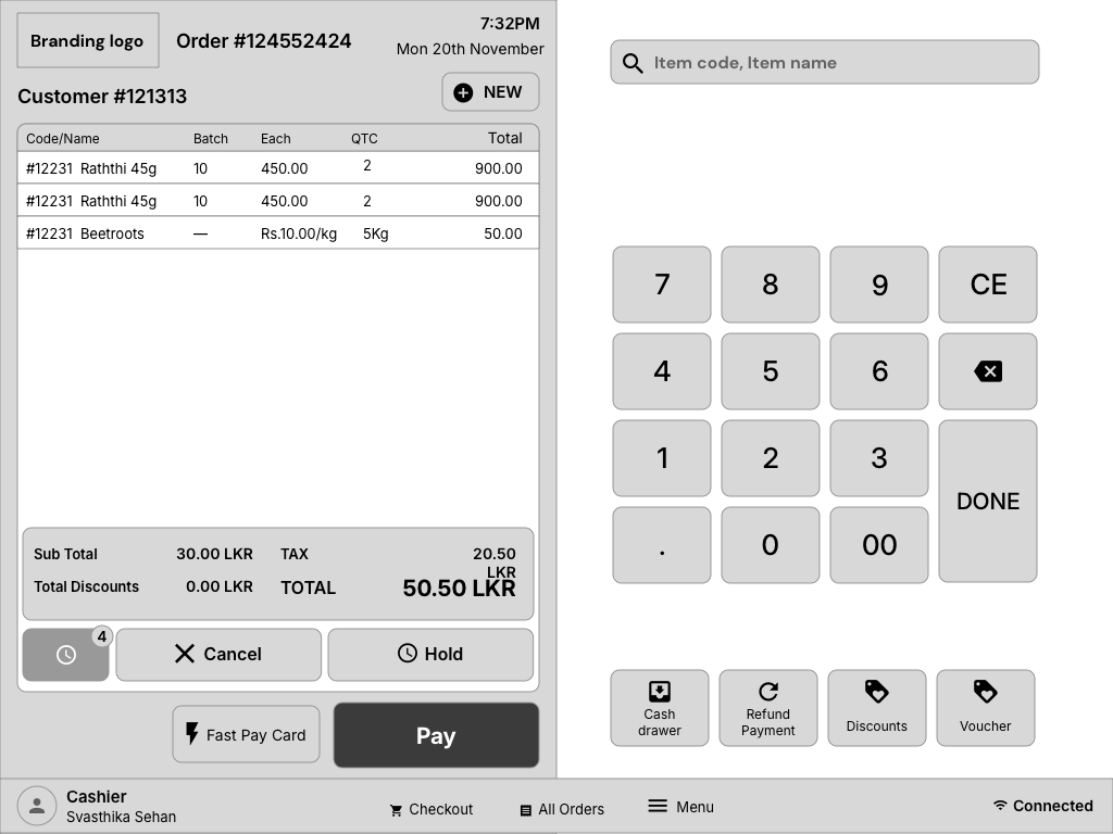
Retail checkout - dense transaction control without hiding the basket, totals, or keypad
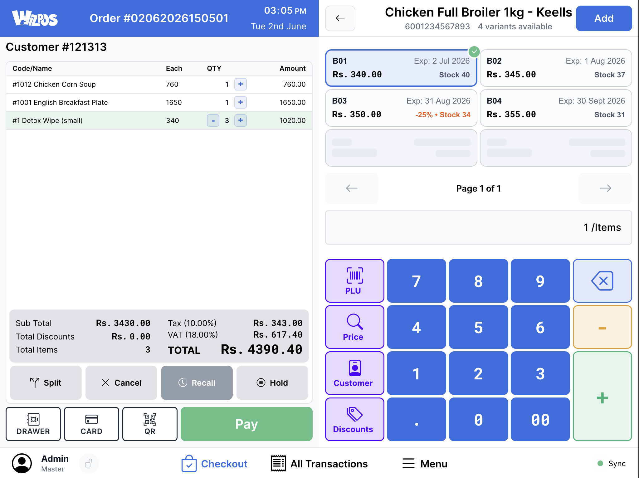
Product selection - SKU detail, price context, and action controls kept close to the sale flow
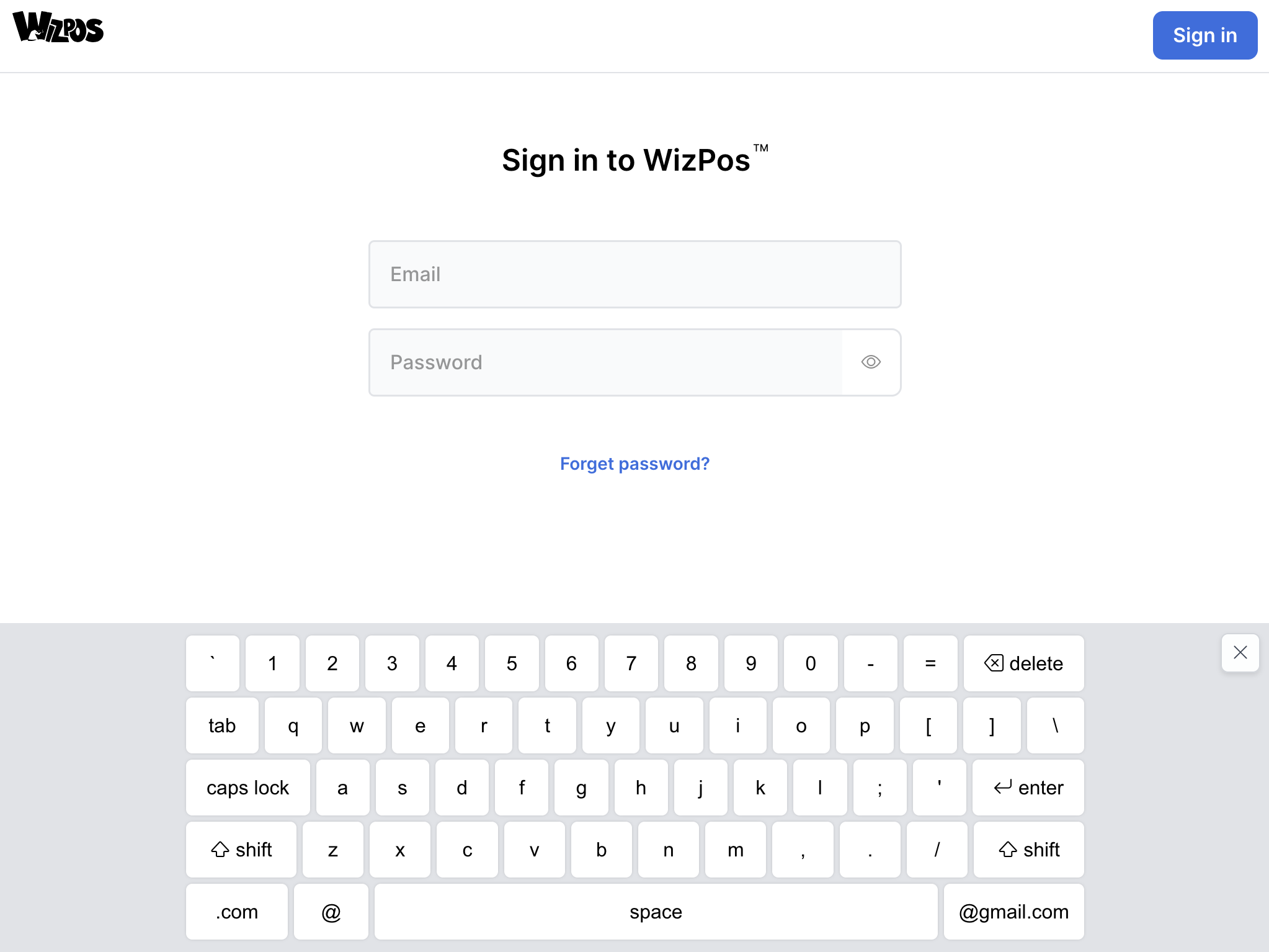
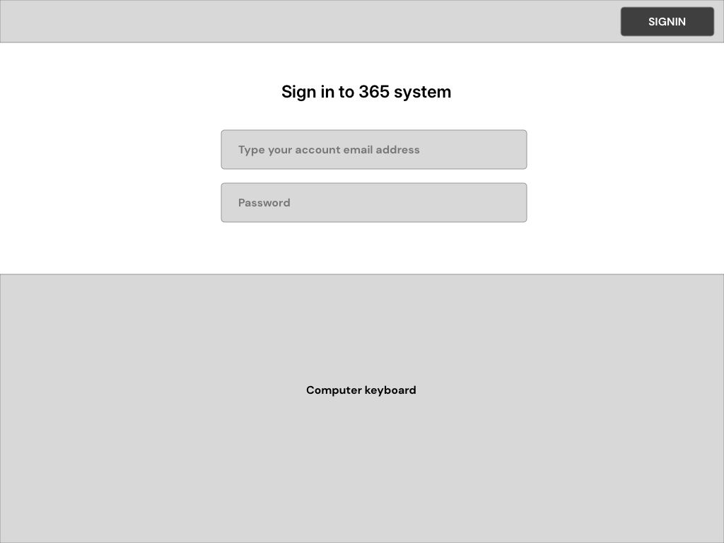
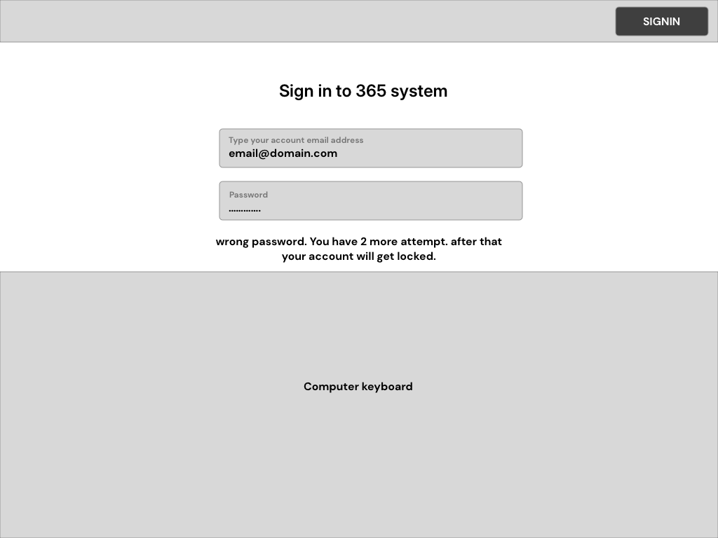
Sign-in - operator authentication designed for touch hardware from the first screen
I covered the project across two levels: the original 2021-2022 product modernization collaboration, and the later WizPos 2.0 product expansion into a broader software suite.
I own the full pipeline: research, product strategy, design in Sketch, interaction prototyping in Principle, UI implementation in HTML/CSS, and delivery alignment with ReactJS/Electron/backend engineering. What I design is connected to execution, because I stay close to how the product is actually built.
I collaborated closely with:
Before drawing a single screen, we invested significant time understanding how POS operators actually work - not how product specs say they should work. Our research approach combined existing industry data with hands-on fieldwork.
We didn't start from zero. We studied published research on retail POS operator diversity and literacy levels across the US and South Asian markets. Key findings we built upon:
We spent weeks observing cashiers in live retail environments across Colombo and suburbs - large-scale supermarket chains, mid-size grocery stores, and small independent shops using random POS setups.

Live retail observation - Keells counter environment (customer-side)
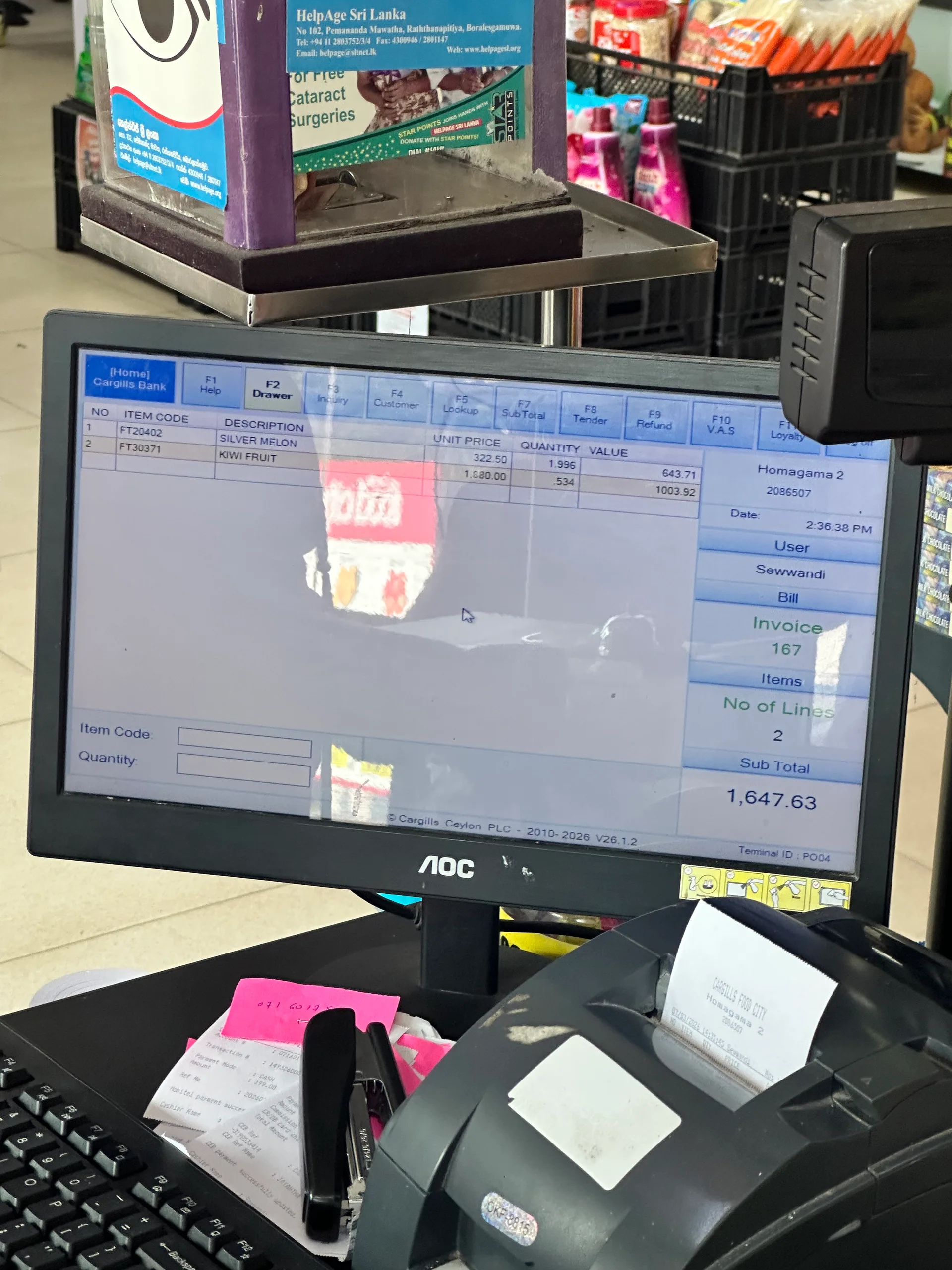
Live retail observation - Cargills checkout station in active use
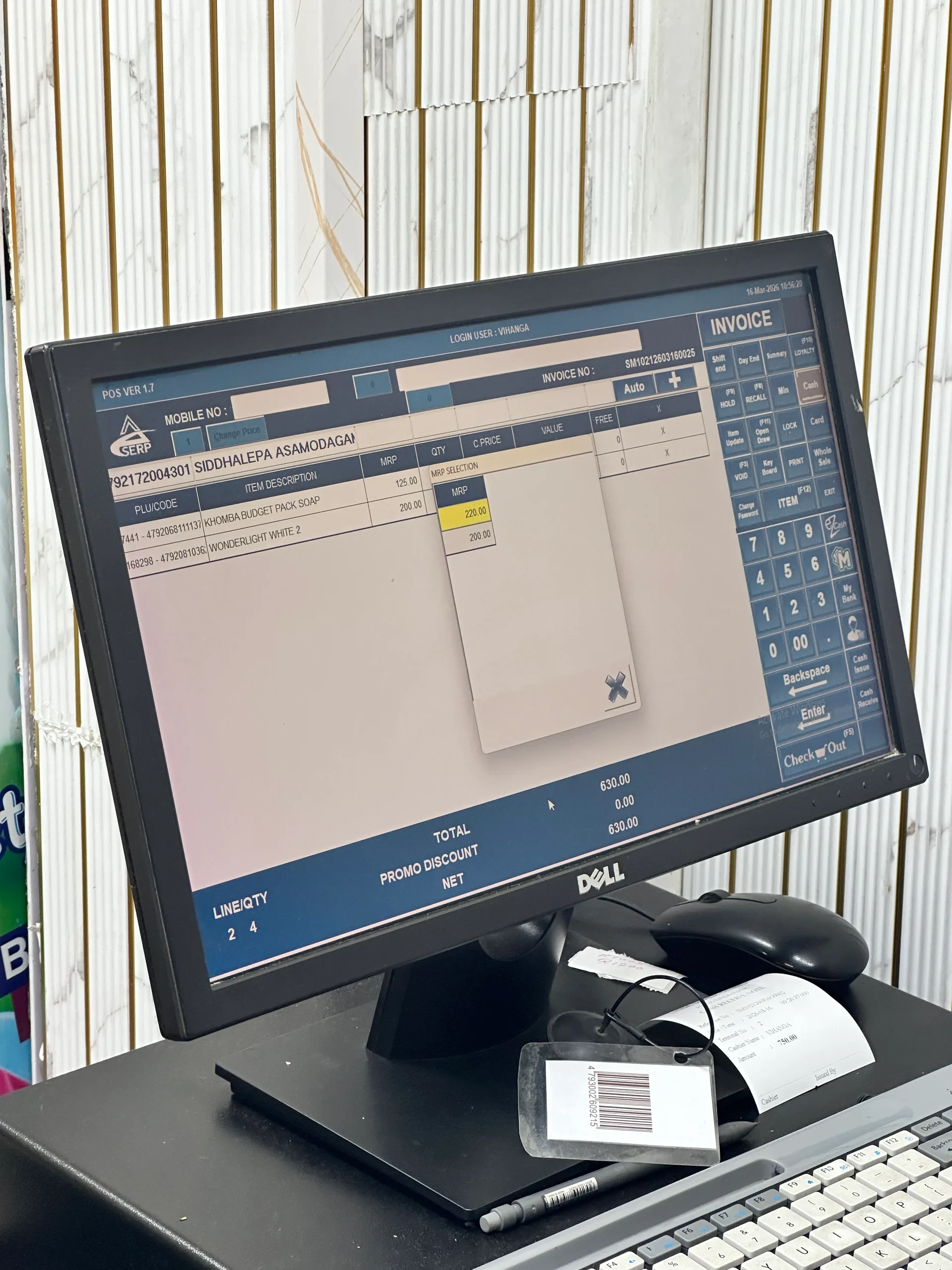
Live retail observation - local supermarket counter and lane behavior
Live retail observation - in-session POS action workflow at checkout
What we observed in the field:
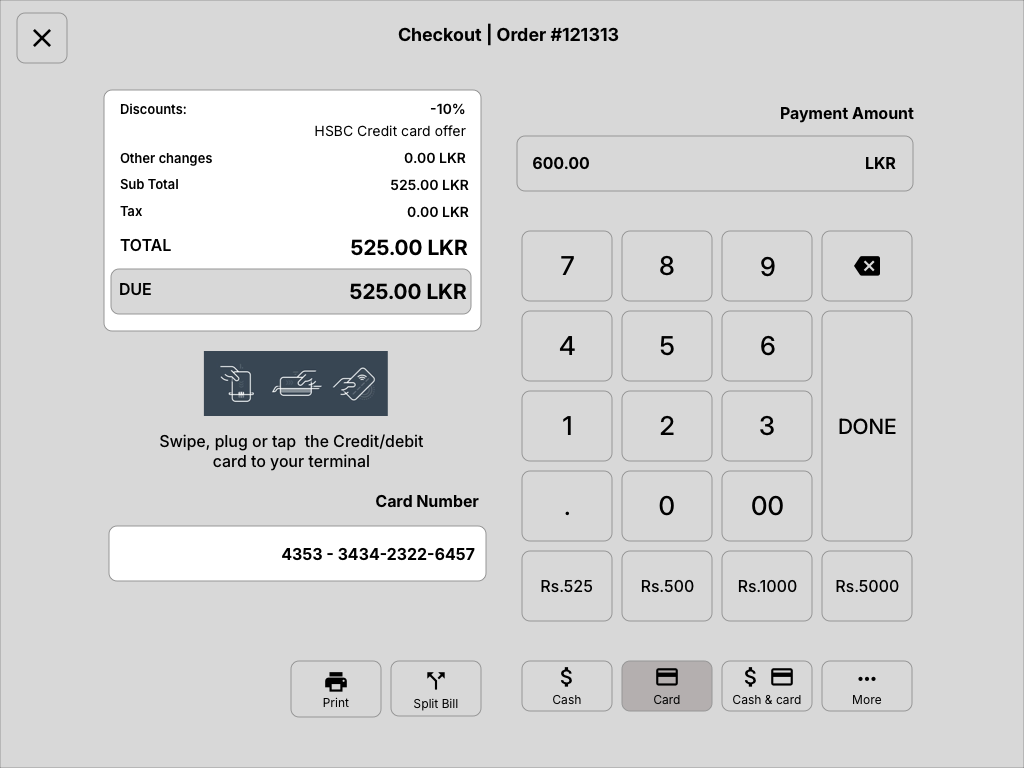
In Sri Lanka, only banks are authorized to run card payment terminals. These are bulky dumb terminals - completely separate devices with no integration capability. Every card transaction forces the operator to physically shift focus away from the POS screen to a disconnected banking terminal, process the payment in isolation, then return to the POS to confirm. This fragmented flow breaks the transaction rhythm, increases checkout time, and prevents us from offering the sleek integrated card reader experience that US POS systems take for granted. We had to design our payment workflow to gracefully accommodate this forced context switch rather than fight against it.
We conducted structured interviews with 15+ cashiers and shift supervisors working in large-scale Sri Lankan retail chains - the closest analog to the US market we were targeting. These were operators processing hundreds of transactions daily on existing POS systems.
I know where every button is by feel.
Experienced operators develop muscle memory. Redesigning layouts means temporarily making your best users slower. We had to balance improvement with familiarity.
The refund screen takes too long.
Returns and voids were the #1 complaint. Not because they're rare, but because when they happen, there's already a frustrated customer waiting.
I wish I could see if something is in stock without leaving this screen.
Inventory visibility during transactions was consistently requested across every interview.
When the internet goes down, we write receipts by hand.
Network dependency was a business-critical pain point, especially outside Colombo metro areas.
We audited POS systems in select independent shops - hardware store, pharmacy, textile shop, bakery - to understand the diversity of POS usage beyond supermarkets. These small businesses often used budget POS hardware with off-the-shelf software, giving us insight into the baseline expectations and pain points of the broader market.
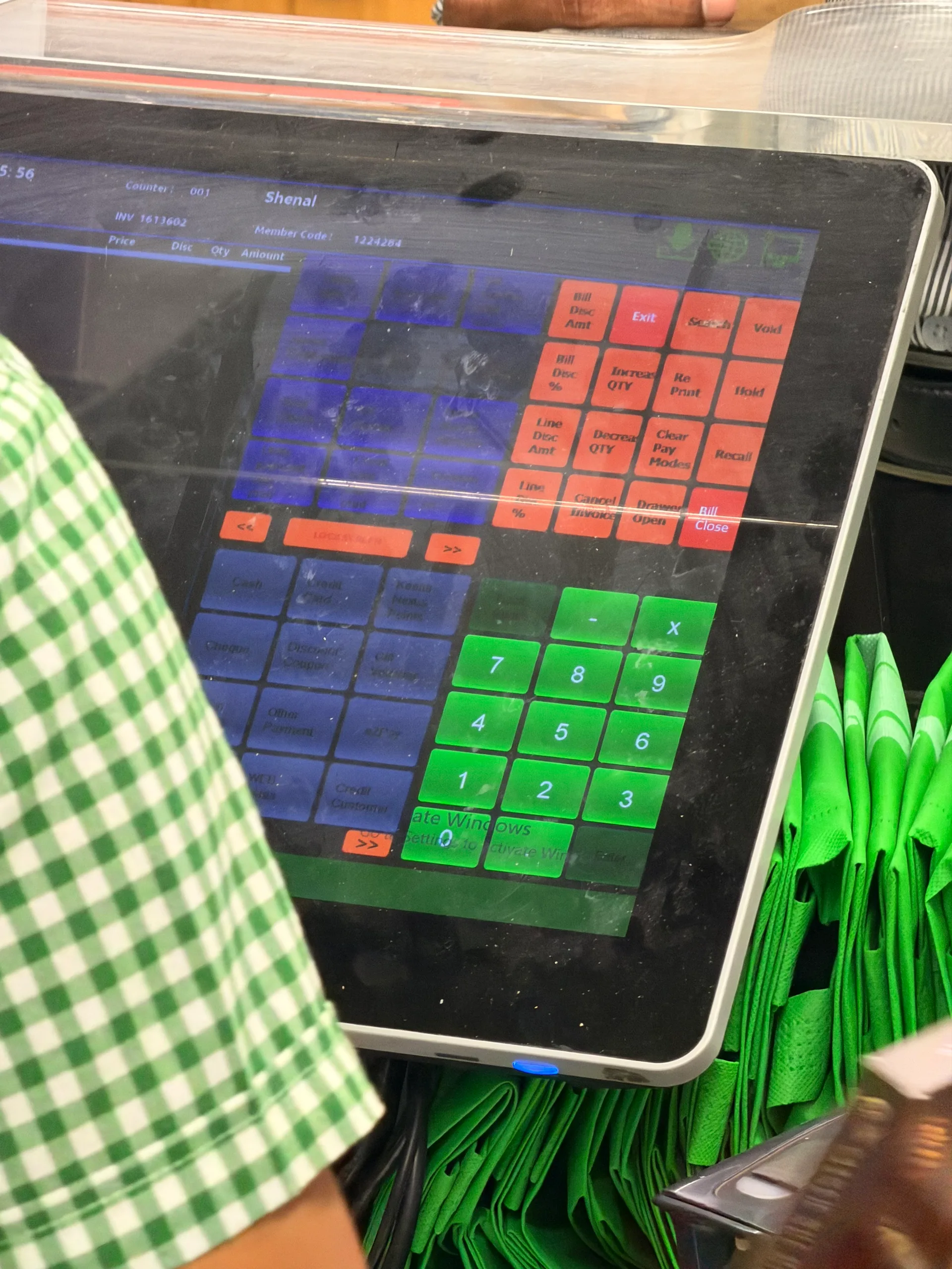
Old screen set from the earliest developer handoff - baseline checkout
Old screen set - main billing interaction before redesign
Old screen set - split bill behavior from initial system structure
For the US market - our primary commercial target - we combined secondary research, competitive analysis of incumbent systems (Square, Toast, NCR, Oracle MICROS), and advisory input from retail consultants familiar with American operator workflows.
US retailers expect PCI-DSS compliance, ADA accessibility considerations, and EMV chip/tap support as baseline - not premium features.
Large US chains allocate 4-8 hours for POS training. The system must be learnable in that window or operators will reject it.
American wholesale operators expect sub-3-second transaction totals. Any lag is perceived as a system failure, not a loading state.
US retail has high turnover. Systems must onboard new staff quickly regardless of tech literacy, age, or language background.
One of the most critical and often overlooked aspects of POS design is the physical interaction. A POS terminal isn't a phone or tablet - it's operated for 8-hour shifts, at specific angles, with varying hand sizes and fatigue levels. We treated touch ergonomics as a core design constraint, not an afterthought.
Adult fingertip pad widths range from 10mm to 14mm across demographics. Sri Lankan female operators trend toward the smaller end; American male wholesale staff trend toward the larger end. A single touch-target size must accommodate this full range.
We standardized on 18mm minimum touch targets (exceeding both Apple HIG 44pt and Material Design 48dp guidelines) with 4mm inter-element spacing. For primary action buttons (Tender, Void, Refund), we went larger - 24mm targets - to reduce mis-taps on high-stakes actions.
Mis-tap rates dropped significantly in prototype testing. Operators across both markets could hit targets reliably regardless of hand size, screen angle, or shift fatigue.
Through observation, we tracked how operator tapping behavior changes across a shift. Early in the day, taps are centered and precise. By hour 6-8, taps drift toward screen edges, become less precise, and operators unconsciously decrease tap pressure.
We designed hit zones slightly larger than the visible button boundaries (invisible touch padding). Primary actions were placed in the screen's natural "comfort zone" - center-right for right-handed operators - with less-critical options pushed to edges.
End-of-shift error rates in testing were comparable to start-of-shift. The interface forgave the natural degradation that comes with 8 hours of physical interaction.
POS terminals are mounted at various angles - flat countertop, tilted stands, vertical kiosks. The angle of finger approach changes which screen regions are easy to reach and which cause wrist strain.
We mapped comfortable reach zones for common terminal positions and placed high-frequency actions within the "effortless reach" area. Manager-only functions were placed in harder-to-reach zones - reducing accidental triggers while remaining accessible when needed.
Operators reported reduced wrist fatigue during extended testing sessions. The layout felt "natural" across different hardware setups without any reconfiguration.
Touch ergonomics mapping - thumb and reach behavior study
Refined wireframe - quantity and badge interactions for safer high-speed taps
Synthesizing field observations, interviews, and market research, we identified four core problems that defined our design challenge:
Cashiers work under sustained time pressure - processing transactions, managing queues, and handling interruptions. Every UI element competes for attention, and slow decision-making creates bottlenecks that ripple through the entire store.
A Sri Lankan supermarket cashier faces a dense menu with 20+ options (Refund, Suspend, Discount, Tender, Customer, Drawer, Settlement) with no visual hierarchy. A customer returns an item during peak hours - the cashier hunts for the correct workflow while six people wait in line.
Transaction times inflate by 30-60 seconds per exception. Customer frustration builds. Staff stress leads to more errors, creating a negative feedback loop during the busiest periods.
American and Sri Lankan retail operate on fundamentally different assumptions. US chains prioritize speed-per-transaction and labor efficiency. Sri Lankan operators prioritize cash management, flexibility, and multi-role access. A single interface trying to serve both created friction for everyone.
In US wholesale, a cashier processes 40+ items, hits "Total," taps a payment method, and moves to the next customer. In Sri Lanka, the same transaction might involve a mid-sale price check, a manual discount negotiation, a partial cash/card split, and a drawer reconciliation - all before the next customer.
One-size-fits-all workflows meant US operators saw unnecessary complexity, and Sri Lankan operators missed critical shortcuts. Both markets required workarounds to get their jobs done.
Operators frequently need to answer stock questions during transactions - "Do you have this in another size?" "When will this be back?" - but the POS kept transactional and inventory data completely siloed.
A wholesale floor manager spots a fast-moving item running low. To check stock levels, they need to leave the register, log into a separate inventory system, look up the SKU, and return. By then, three more customers have arrived and the item may already be out.
Lost upsell opportunities. Stockouts during peak periods. Managers spending half their time context-switching instead of serving customers. Small retailers losing revenue because they couldn't see what was right in front of them.
When things went wrong - declined payments, barcode failures, network drops - the system showed technical error codes and generic menus. Operators were left to figure out recovery paths on their own, often with a frustrated customer watching.
A payment terminal returns "Error 0x4E - Transaction timeout." The cashier doesn't know if the payment went through, whether to retry, or if money was already charged. They call the manager. The manager doesn't know either. The customer is now irritated. Everyone is guessing.
Manager calls for routine issues. Double-charges or lost transactions. Customer trust eroded. Staff anxiety around payment handling - the most critical moment of every transaction.
Our field research revealed a consistent truth across both markets: the problem was never missing features. Every transaction type was technically possible in the existing system.
The problem was findability, context, and physical ergonomics - the human layer that makes software usable under real-world pressure.
WizPOSTM faced a specific set of constraints that shaped every design decision:
Designed and validated from Colombo, but shaped for international retail and hospitality expectations. The product had to feel fast enough for American-style checkout while still fitting Sri Lankan counter realities.
Limited time to ship a market-ready product for international deployment. No room for exploratory design - every decision needed to be validated quickly.
Supporting fundamentally different retail cultures without forking the codebase or shipping two separate products.
7" mobile carts, 10" tablets in small shops, 15" touchscreen terminals in chains - one interface across all screen sizes.
Sri Lankan retail operates with inconsistent connectivity outside metro areas. US wholesale floors have dead zones. Offline-first wasn't optional - it was survival.
In Sri Lanka, only banks are authorized to operate card payment terminals. These are bulky dumb terminals running as completely separate devices - the operator must switch focus away from the POS to a disconnected banking terminal for every card transaction. This prevented us from using an integrated card reader and forced us to design around an inherently fragmented payment flow.
Rather than building separate versions for each market, we designed the core POS with workflow configuration at its center. Regional partners could customize transaction flows, menu layouts, drawer behaviors, and shortcut mappings while sharing a common codebase.
This approach meant designing interactions that were flexible yet consistent - a Sri Lankan operator's drawer settlement flow and an American operator's quick-tender flow had to feel like the same product, even though they served different needs.
Ship a product that can stand beside mature POS and hospitality systems - meeting speed, usability, operational visibility, and deployment expectations across retail counters, restaurants, hotels, and large-SME branches.
Use Sri Lanka's diverse retail landscape - supermarkets, independent shops, wholesale - as an intensive testing ground before US market entry. If it works in Colombo's chaotic retail environment, it'll work anywhere.
Design the system to be extensible - allowing teams to configure workflows, branding, order flows, room/table/service models, and operational patterns without engineering involvement.
Speed up checkout by reducing taps, eliminating menu hunting, and surfacing the right actions at the right moment. Target: 95% of transactions completable without navigating away from the main screen.
Touch targets, layouts, and interaction patterns must work across the full range of operator demographics - varying fingertip sizes, tech literacy levels, language backgrounds, and 8-hour fatigue cycles.
Live transaction data, inventory alerts, and shift performance - accessible from the register without context-switching to separate tools.
Through field research across Sri Lankan and American retail environments, we identified four primary operator archetypes - each with distinct needs, physical constraints, and workflow expectations:
The daily power user - processing hundreds of transactions across 6-8 hour shifts. Works under constant time pressure, manages customer interactions, and handles edge cases while maintaining speed. Ranges from first-job teenagers to 20-year veterans with deeply ingrained muscle memory.
When I'm at the register during peak hours, I want to process every transaction - including returns, discounts, and payment splits - without hunting through menus, so I can keep lines moving and avoid frustrating customers or calling my manager.
Supervises operations, handles cashier exceptions, approves voids and refunds, and needs real-time visibility into sales performance and inventory status. In Sri Lankan retail, often doubles as the primary cashier during slower periods.
When I'm managing the floor, I want instant access to live transaction data, override approvals, and stock status without leaving the register area, so I can resolve issues in seconds - not minutes.
Responsible for store-level profitability, staffing, inventory management, and operational decisions. In Sri Lankan independent retail, this person often is the cashier. In US chains, they're focused on metrics and policy configuration.
When I'm reviewing store performance, I want clear sales trends, inventory health, and staff efficiency data in one place, so I can make quick decisions about ordering, pricing, and staffing without juggling multiple systems.
Deploys and configures POS systems across multiple locations. Handles hardware setup, workflow customization, payment processor integration, and regional compliance. The gatekeeper between product capability and operational reality.
When I'm rolling out WizPOS across stores, I want to configure market-specific workflows, payment integrations, and hardware settings through intuitive admin tools - so I can deploy 10 stores in a week without custom development for each.
I mapped every transaction workflow at granular level - not just "process sale" but every decision point, exception, and recovery path. What happens when a barcode doesn't scan? When payment declines mid-tender? When a customer wants to split payment across three methods? When manager approval is needed for a refund above the threshold?
We mapped these flows for both market contexts side-by-side, identifying shared patterns (which became core workflows) and divergent patterns (which became configurable modules).
Initial flow reference - early checkout structure before redesign
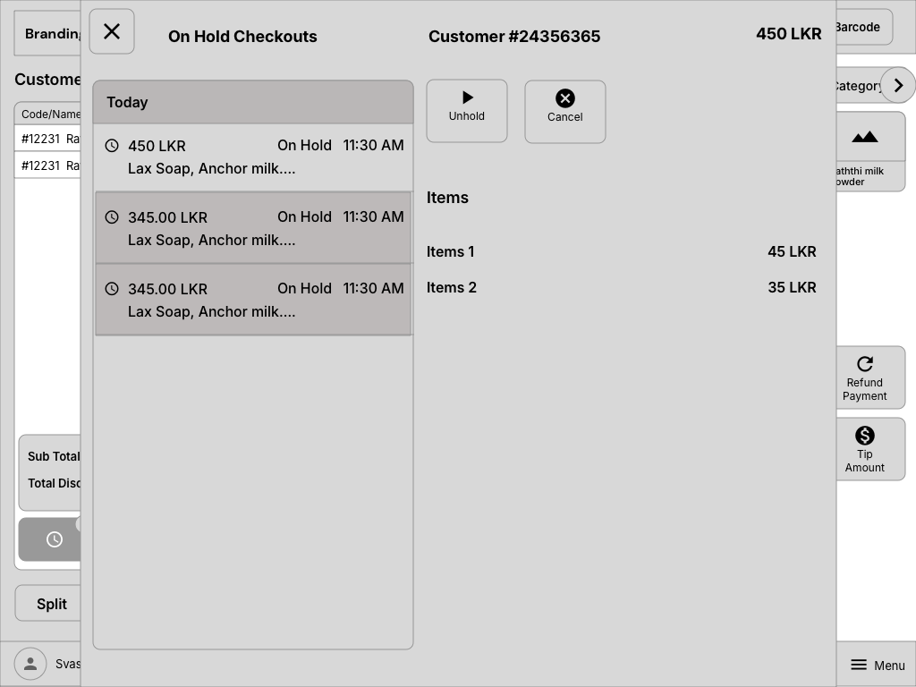
Refined flow structure - hold orders and state transitions for real checkout interruptions
For the highest-frequency tasks - item scanning, tendering, discounts, voids - I prototyped multiple interaction patterns and speed-tested them with actual operators. We measured taps-to-completion, time-on-task, and error rates for each approach.
Every millisecond of decision time matters in retail. A POS that takes 2 seconds longer per transaction costs a busy cashier 30+ minutes of wasted time per shift.
Test-environment recording of core WizPos operations (live interaction pass)
I explored multiple layout directions through rapid sketching - challenging assumptions about where action buttons should live, how item lists should scroll, and whether the traditional "left-list, right-actions" POS layout was actually optimal. The answer, based on research: it depends on the operator's handedness and screen angle.
Baseline layout from old system used for first comparative redesign passes
2021 redesign wireframe set - cleaner entry state and role-first flow
Here's how we solved the core challenges - each decision informed by field research, operator testing, and the dual-market constraint:
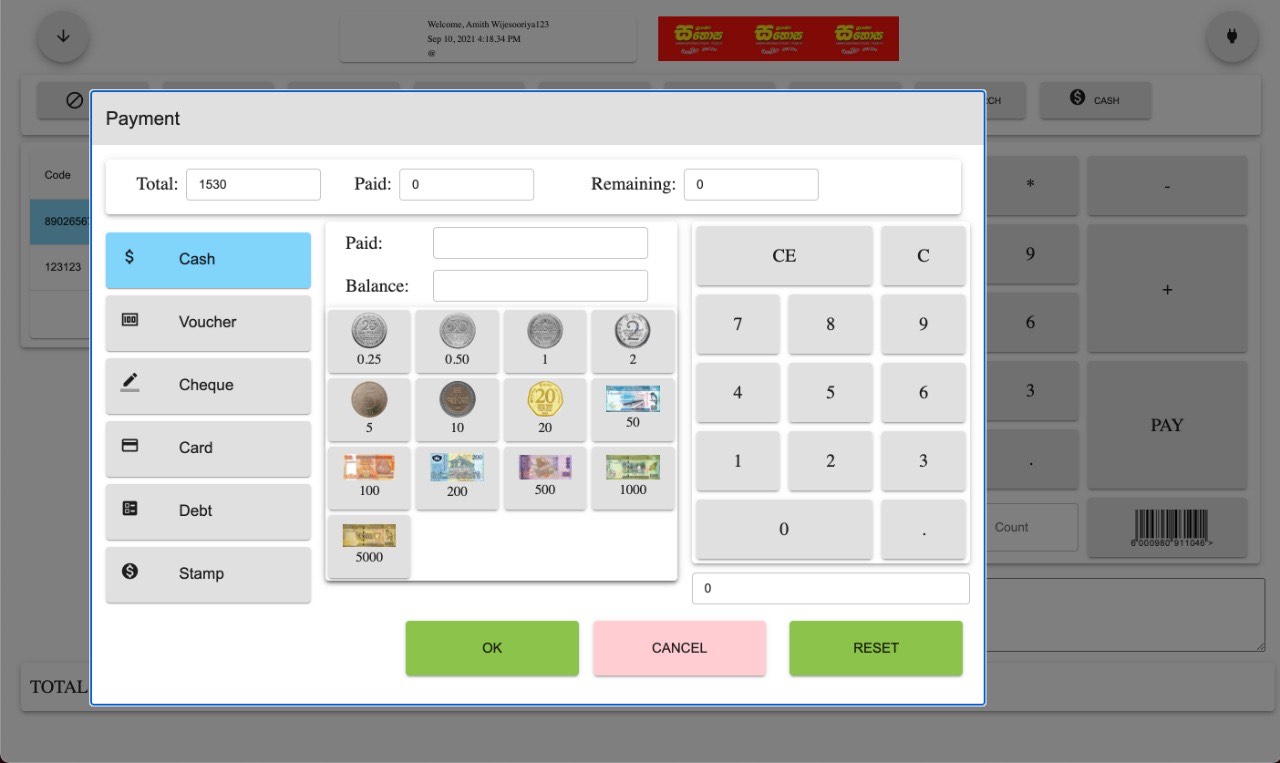
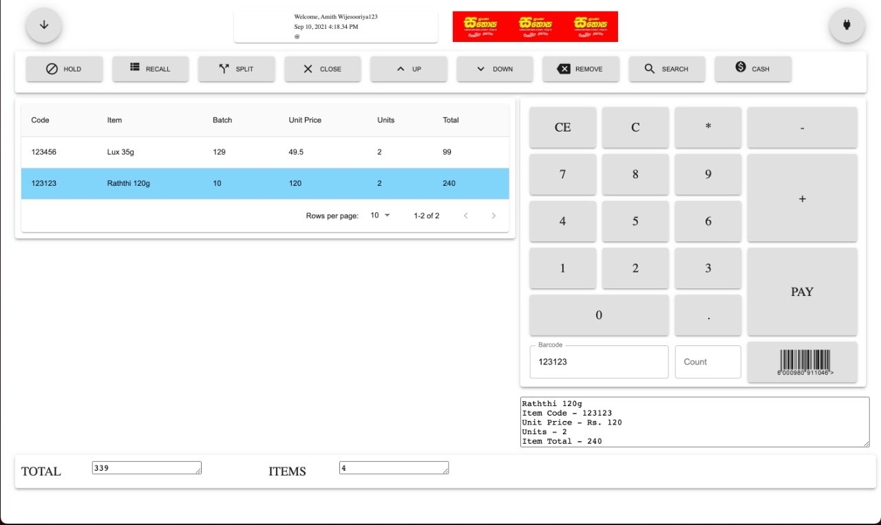
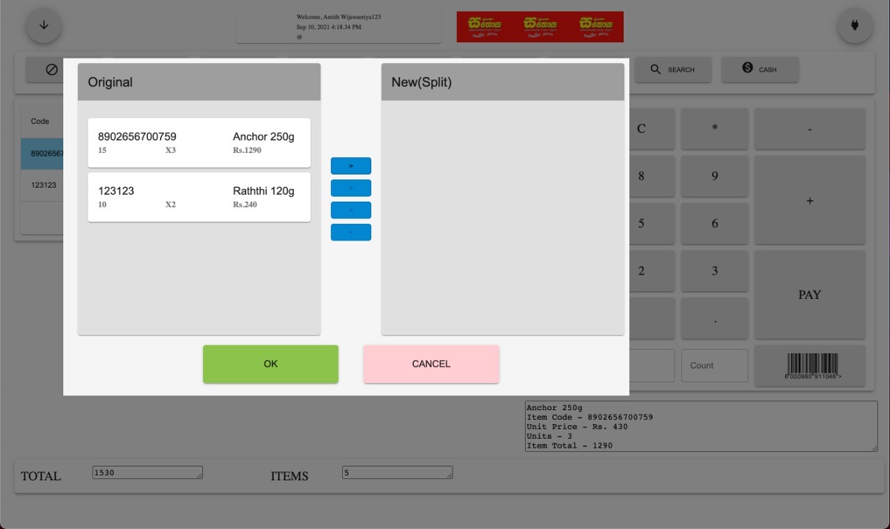
Rather than displaying all 20+ options at once, the transaction interface shows only the most common actions for the current context. Scanning items? You see quantity, discount, void. Ready to pay? You see tender methods. Processing a return? You see refund options.
The main screen stays clean: Tender, Refund, Discount, Void, Suspend, Customer. Everything else is one contextual tap away - no nested menus, no hunting.
Progressive disclosure in action - focused controls during item addition
Retail teams get streamlined, speed-optimized checkout flows - minimal steps from scan to tender. Hospitality teams get table flows, order-taking states, guest details, payment posting, and settlement behavior as first-class patterns. Sri Lankan operators still get drawer settlement, mid-shift reconciliation, and flexible cash-handling workflows.
Admin panels let teams customize menu visibility, keyboard shortcuts, transaction behaviors, receipt formats, room/table/service models, and tax rules without touching code.
Configuration-first entry model - industry-driven onboarding and deployment paths
Instead of "Error 0x4E," the POS speaks operator language. Payment declined? "Card was declined. Try again, use a different card, or switch to cash." Barcode not found? "Item not recognized. Enter SKU manually, search by name, or scan again."
Every error state becomes a guided decision tree - not a dead end. Operators always know what happened and what to do next.
Human-readable error handling - direct recovery guidance at point of failure
We embedded a lightweight operations dashboard accessible from the main register - live transaction feed, inventory alerts, shift performance metrics, and approval queues. Managers don't leave the floor to manage the floor.
Operational visibility surfaces in-context without forcing managers out of the lane flow

Completion state modeling for cleaner shift-level monitoring and audit clarity
One interface across 7" mobile carts, 10" tablets, and 15" terminals. Layouts adapt intelligently - not just scaling, but restructuring. On smaller screens, secondary actions collapse into swipe gestures. On larger screens, inventory and reporting panels appear alongside the transaction view.
Touch targets remain 18mm minimum on every screen size. Primary actions stay in the comfort zone regardless of terminal angle or mounting position.
The POS works fully offline - transactions process locally, receipts print, drawers open. When connectivity returns, data syncs automatically with conflict resolution. No more "Internet is down, we can't ring sales." No more handwritten receipts during outages.
This was non-negotiable for Sri Lankan retail outside Colombo metro and equally critical for US wholesale floors with connectivity dead zones.
The initial collaboration phase built the product foundation and proved that the interface could be modernized for real counters, not just cleaner screens. We worked with retail operators to validate core workflows and interaction patterns under real conditions.
WizPos 2.0 expands that foundation into a broader operating suite: retail checkout, hospitality service points, cloud-backed control, multi-branch monitoring, and a product architecture that can grow with large-SME teams.
Sri Lanka's retail landscape is dominated by small, independently-run grocery shops and kade-style (කඩේ) businesses that rely on manual processes - handwritten ledgers, mental stock tracking, and cash-only workflows. These shops serve millions daily but operate without any digital infrastructure. The gap between these traditional shops and organized supermarket chains isn't just technological - it's systemic.
Software like WizPOSTM has the potential to bridge that gap. By offering an affordable, intuitive system designed for Sri Lankan retail and hospitality realities - unreliable connectivity, diverse hardware, high staff turnover, and operators who may never have used business software before - it can bring supermarket-grade inventory tracking, sales analytics, cash management, and service visibility to smaller operators. This isn't about replacing how businesses work. It's about digitizing what they already do and unlocking visibility they've never had.
Current adoption of digital systems across Sri Lankan retail tiers, and where WizPOS aims to make the biggest impact:
The bottom two tiers represent the largest volume of retail operators in Sri Lanka, and the least digitized. WizPOS targets this gap directly.
The 2021-2022 collaboration built the operational foundation. WizPos 2.0 is where I expanded that product thinking into a full local + cloud ecosystem for retail, hospitality, and large-SME operations. Product direction, UX systems, and implementation quality are now governed through my ownership across design, ReactJS/Electron product layers, and backend-connected workflows.
The most valuable research data came from watching operators' hands - where they hesitated, where they mis-tapped, where their rhythm broke. Interviews told us what operators thought they did. Observation showed us what they actually did. The two rarely matched.
A POS interface that works perfectly for a rested operator in the morning means nothing if it falls apart during the fatigue and pressure of hour 7. We learned to test at the end of shifts, not the beginning. That's when the real usability problems reveal themselves.
If a POS system survives the chaos of Sri Lankan retail - inconsistent power, unreliable internet, diverse hardware, operators handling cash and conversation simultaneously - it's ready for any market. Our Sri Lankan validation phase caught issues that controlled lab testing would have completely missed.
The choice to make workflows configurable rather than hard-coded wasn't just an engineering architecture decision - it was a UX decision. It meant designing interaction patterns that remained coherent regardless of which modules were active. That's harder than designing one fixed experience, but infinitely more scalable.
WizPOS taught me that POS and hospitality design is physical operations design. It's not just screens and flows - it's fingertips, fatigue, guests waiting, orders moving, payments settling, and managers needing visibility now. Getting the human layer right means faster transactions, less training, and real economic impact for every operator who adopts the system.
Thank you for reading through the WizPOS case study.
WizPos 2.0 now stands as a full product direction for an AI-first POS and hospitality software suite.
